A match-3 board is a reading task disguised as a game. Before you can make a move you have to scan a grid of forty or fifty pieces, find the pairs that are one swap away from a line, and do it in a second or two so that the game keeps feeling quick. Everything a designer puts on that grid either helps you read it or gets in the way.
Colour alone is not enough
The cheapest way to build a board is six sweets in six colours. It works until the moment the board fills with glaze, jelly or icing overlays, at which point two of the six start to look the same under a tint. It also fails outright for the substantial share of players with red–green colour vision deficiency, who then have to guess at exactly the two colours most of these games use for their primary pieces.
The games that stay readable give every piece a distinct silhouette as well as a distinct colour: a round biscuit, a square wafer, a twisted lolly, a tall jar. You can play those with the saturation turned down and still see the matches. It is the single clearest signal of a board that has been designed rather than assembled.
The goal has to live outside the grid
The second thing that separates a clear game from a busy one is where the objective sits. If the level goal is a small badge tucked into a corner behind an animated character, you will spend the first few moves of every stage working out what the game wants. If it is printed in a strip along the top with a plain counter, you never think about it again.
Cake Blast does this well simply by having nothing else on the screen. Sweet Escapes puts more on the display because there is a bakery to look at, and pays for it with a busier top bar. Neither approach is wrong, but the second one asks more of you at the start of each level.
Animation is a cost, not a feature
Cascades are the pleasure of the genre — a match resolves, pieces fall, another match resolves on its own. The trouble starts when the animation carries on long enough that you cannot plan the next move until it finishes. A board that spends three seconds celebrating every clear turns a ten-minute session into six minutes of playing and four minutes of watching.
The better implementations let you tap through, or keep the celebration short and put the fireworks on the level completion screen where they belong.

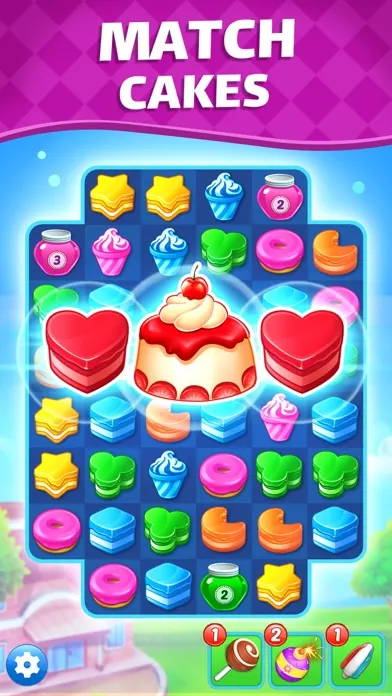
Screenshots taken from the official store listings for Cookie Jam and Cake Blast. All rights remain with their publishers.
Density and the thumb
A nine-by-nine grid on a six-inch screen puts each piece at roughly the width of a fingertip. That is fine for looking at and awkward for tapping, because your thumb covers the piece you are about to swap. Seven columns is the comfortable maximum for one-handed play; games that go wider are quietly asking you to use two hands, whether they say so or not.
What to look at before installing
- Do the pieces differ in shape, or only in colour?
- Where is the goal counter, and is anything animated sitting on top of it?
- How wide is the grid in the screenshots?
- Is there a settings toggle for reduced motion or faster animation?
None of this tells you whether a game is fun. It tells you whether you will still be able to see it after an hour, which for this genre is nearly the same question.